Larkin and Seider Buck the Olympic Stick Graphic Trend
By Matt Stathopoulos
02/22/2026
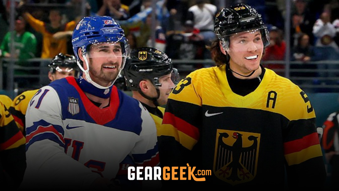
The 2026 Milano Cortina Olympic Winter Games have officially wrapped up, and the Detroit Red Wings are welcoming back two of their cornerstone players after another memorable international showcase.
Dylan Larkin will return to Hockeytown as a gold medalist after Team USA defeated Canada in a thrilling men’s final, while Moritz Seider heads back to Detroit without hardware but with another proud performance representing Germany on the world stage.
Beyond their on-ice contributions, both players quietly became part of one of the more interesting equipment storylines of the tournament.
Major international events like the Olympics are prime opportunities for equipment companies to elevate their presence. With the entire hockey world watching, brands often step up their game by introducing flashy stick graphics, updated models, and subtle design tweaks meant to stand out under the brightest lights. The 2026 Winter Games were no exception.
CCM Hockey, for example, recently launched the 2026 edition of its Vizion stick. For the Olympics, many CCM sponsored players were equipped with special country themed versions of the Vizion.
These sticks featured national flag elements and bold color schemes that matched the jerseys of their respective teams. From red white and blue themes for the United States to striking European designs, the customized graphics were hard to miss.
Historically, however, convincing players to switch into these special edition graphics has not always been easy. Hockey players are famously creatures of habit.
Superstition plays a significant role in the sport, and even minor visual changes can make some players uncomfortable. For many, consistency is everything, right down to the look of the stick in their hands.
Team USA forward Tage Thompson provided a perfect example of this dynamic. During the early portion of the tournament, Thompson was using a stick dressed as CCM’s Tacks XF Ghost model, the familiar all-black look he has favored with the Buffalo Sabres this season.
Eventually, he did transition into a sharp USA themed Vizion graphic for the final two games, including the gold medal matchup of course. His shift illustrated both the initial reluctance and eventual embrace of the Olympic specific designs.
Overall, the 2026 Games could be considered a success from a branding perspective. A noticeable number of players across multiple countries opted to showcase their national pride not only through their jerseys, but also through their hockey sticks.
That is what made the choices of Dylan Larkin and Moritz Seider stand out even more.
Both Red Wings teammates have largely been CCM stick users this season, and both were first seen in the early stages of this NHL season using a Vizion prototype graphic. This prototype design was extremely understated.
It featured an all-black shaft with minimal text and a simple CCM logo positioned near the top. No bold accents. No bright highlights. Just a clean and almost plain aesthetic.
As the Olympics began and more players transitioned into their country themed Vizion sticks, Larkin and Seider did not follow the trend.
Seider kept his all black Vizion prototype graphic for the entire tournament while representing Germany. Larkin, fresh off helping Team USA win gold, used the same bland prototype for all but one game. In a sea of red white and blue graphics and flag inspired designs, the Detroit captain’s stick remained largely unchanged.
Why would two high profile players pass on the opportunity to use a custom Olympic graphic?
We don’t have a definitive answer at this time, but it likely circles back to the mentality shared by many elite players. Larkin and Seider may simply be creatures of habit.
When something feels right, especially in a high stakes tournament, there is little incentive to alter it. Even if the only change is cosmetic, the comfort of familiarity can outweigh the appeal of a flashy new look.
It is also possible that both players genuinely prefer the understated aesthetic. The all-black prototype carries a certain simplicity and focus. No distractions. No extra elements. Just a stick built for performance.
For equipment enthusiasts, the decision added an extra layer of intrigue to the tournament. It was particularly amusing that two teammates from the same NHL club independently stuck with the same understated stick graphic while much of the hockey world embraced bold national designs.
In the end, Larkin returns to Detroit with gold, Seider returns with pride, and both bring back a small but memorable equipment storyline from Milano Cortina. In a tournament filled with vibrant graphics and patriotic flair, the Red Wings duo proved that sometimes sticking with what you know is the ultimate statement.
Photo Credit: Bruce Bennett
Photo Credit: Bruce Bennett
Recent Posts
-
07/13/2026
-
The 10 Best Hockey Sticks of 2025-26
07/06/2026
-
The 10 Best Hockey Skates of 2025-26
07/06/2026
Professional equipment may include modifications not available at retail.
© Copyright 2026 GearGeek | Privacy Policy | Do Not Sell My Info | Terms of Use | Sitemap